Visionary Theater Responsive Website Case Study
UX Researcher // UX Designer
The Challenge:
Many movie theater websites are not as user-friendly as they should be. Users often struggle to preview movies, select dates and times, choose seats, and purchase tickets smoothly on mobile devices. Despite expectations for straightforward navigation, these sites remain cumbersome, making it difficult for users to complete their purchases efficiently.
The Goal:
Design a user-friendly movie theater website that offers clear navigation and a fast, seamless checkout process for purchasing movie tickets.
The process:
The process began with understanding the users through comprehensive research. I conducted user interviews, created detailed personas, formulated problem statements, and developed user journey maps. These tools helped identify pain points and opportunities to improve the overall experience.
User research summary:
After conducting user interviews, I transformed the feedback into empathy maps to gain deeper insight into the target users and their needs. I found that many users watch movie previews on other platforms and rarely visit theater websites because they find them confusing and difficult to navigate. This frustration often leads users to purchase tickets through third-party services instead.
Target Audience:
Ages 18 - 40 yrs old who enjoy going to the movies. They love to shop and have disposable incomes. They are into technology and fashion and lead a more active and busy lifestyle.
Pain points:
Three points emerged after conducting the interviews.
1. Showtimes: Selecting available dates and times on most sites is not intuitive.
2. Ordering: It is difficult to purchase tickets. Navigation seems to lead to a preview or the synopsis of the movie.
3. Payments: More payment options are needed at checkout with the ability to scan/take photos of card payments.
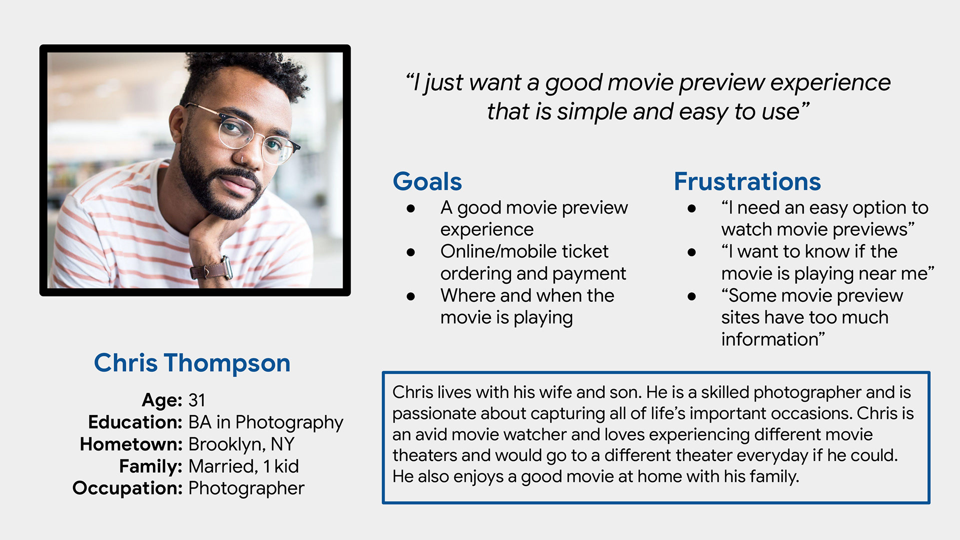
Persona:
Based on the feedback I received I could sum up the information into one persona.
Problem statement:
Chris is a busy photographer who needs intuitive website navigation with a full set of features because he wants online movie preview watching to be gratifying.
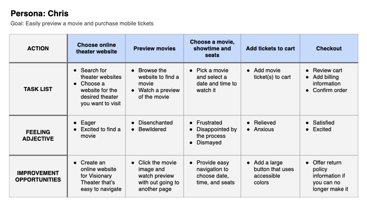
User Journey mapping:
I created a user journey map of Chris’ experience using the site to help identify possible pain points and improvement opportunities.
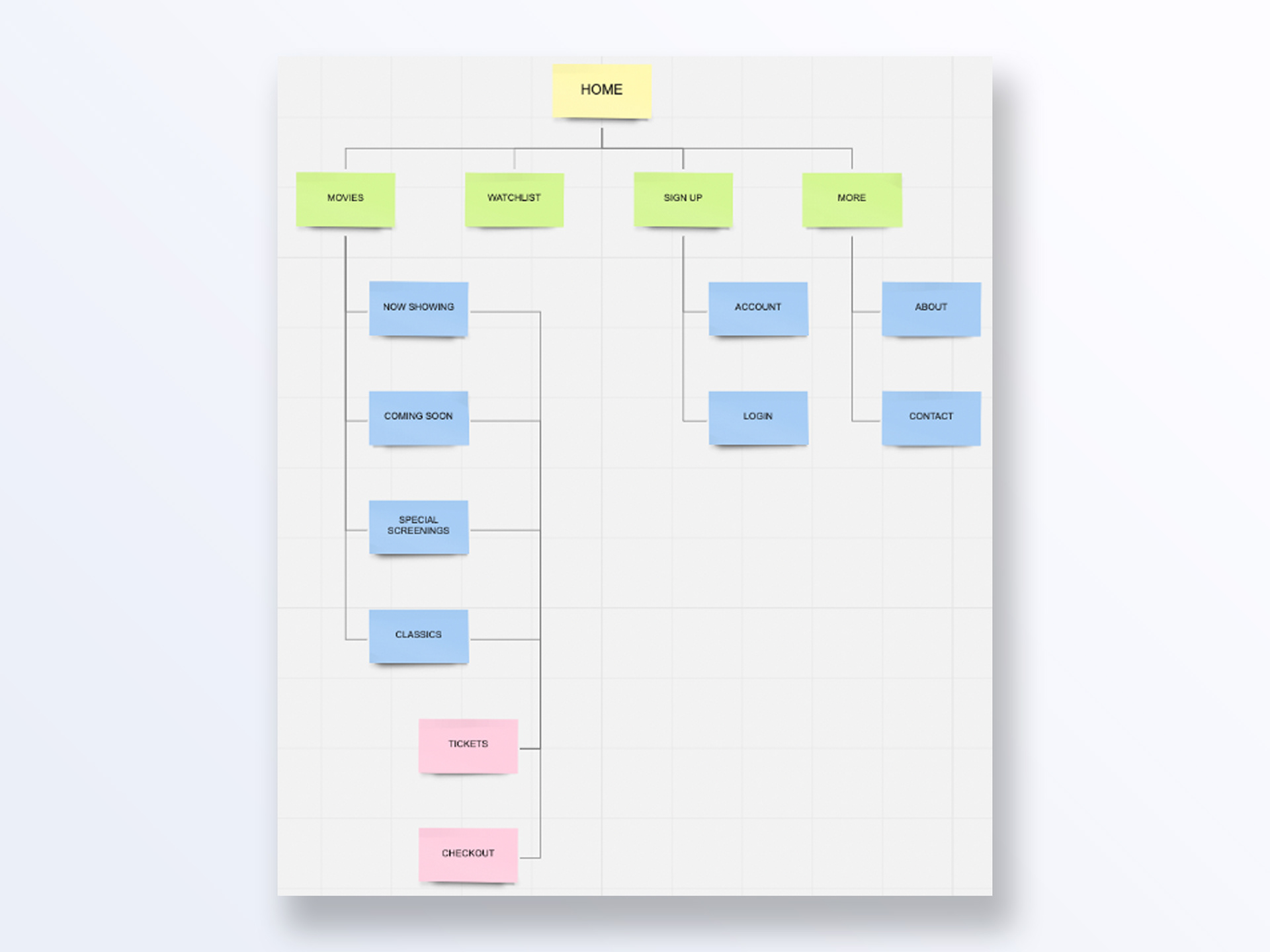
Starting up the design, sitemap:
The first task I tackled was creating the sitemap, addressing users’ primary pain point: difficulty navigating the website. My goal was to make strategic information architecture decisions that improve overall navigation. The chosen structure was simple and intuitive, designed to make it easy for users to find what they need quickly.
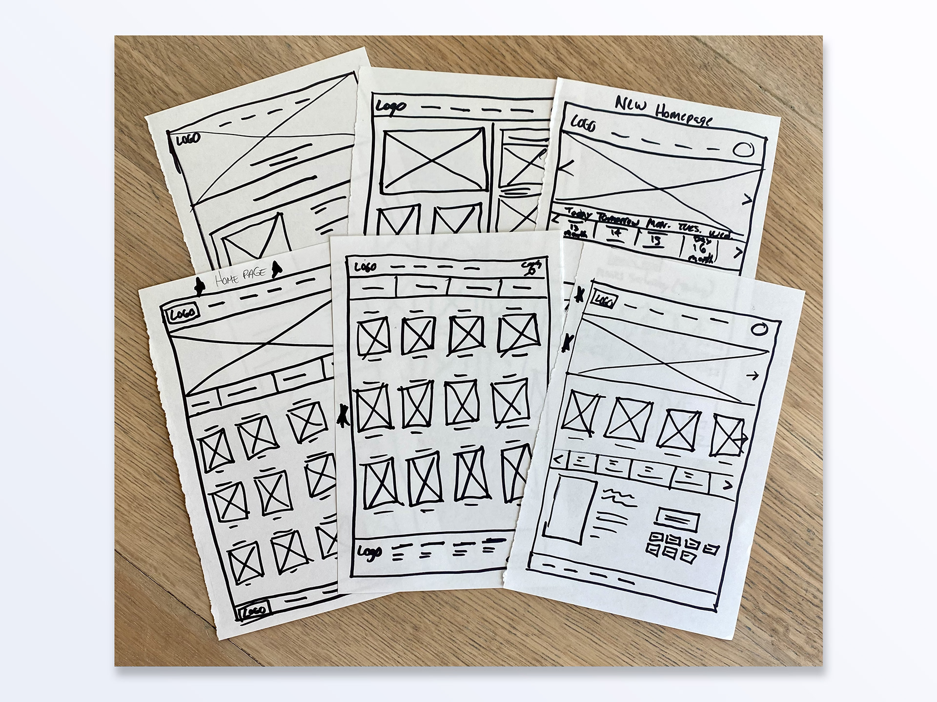
Paper wireframes:
Next, I sketched paper wireframes for each screen on the website, focusing on addressing user pain points related to navigation, browsing, and the checkout flow. The home screen wireframe underwent multiple iterations, with particular attention given to optimizing the browsing experience for users.
Digital wireframes and screen size variations:
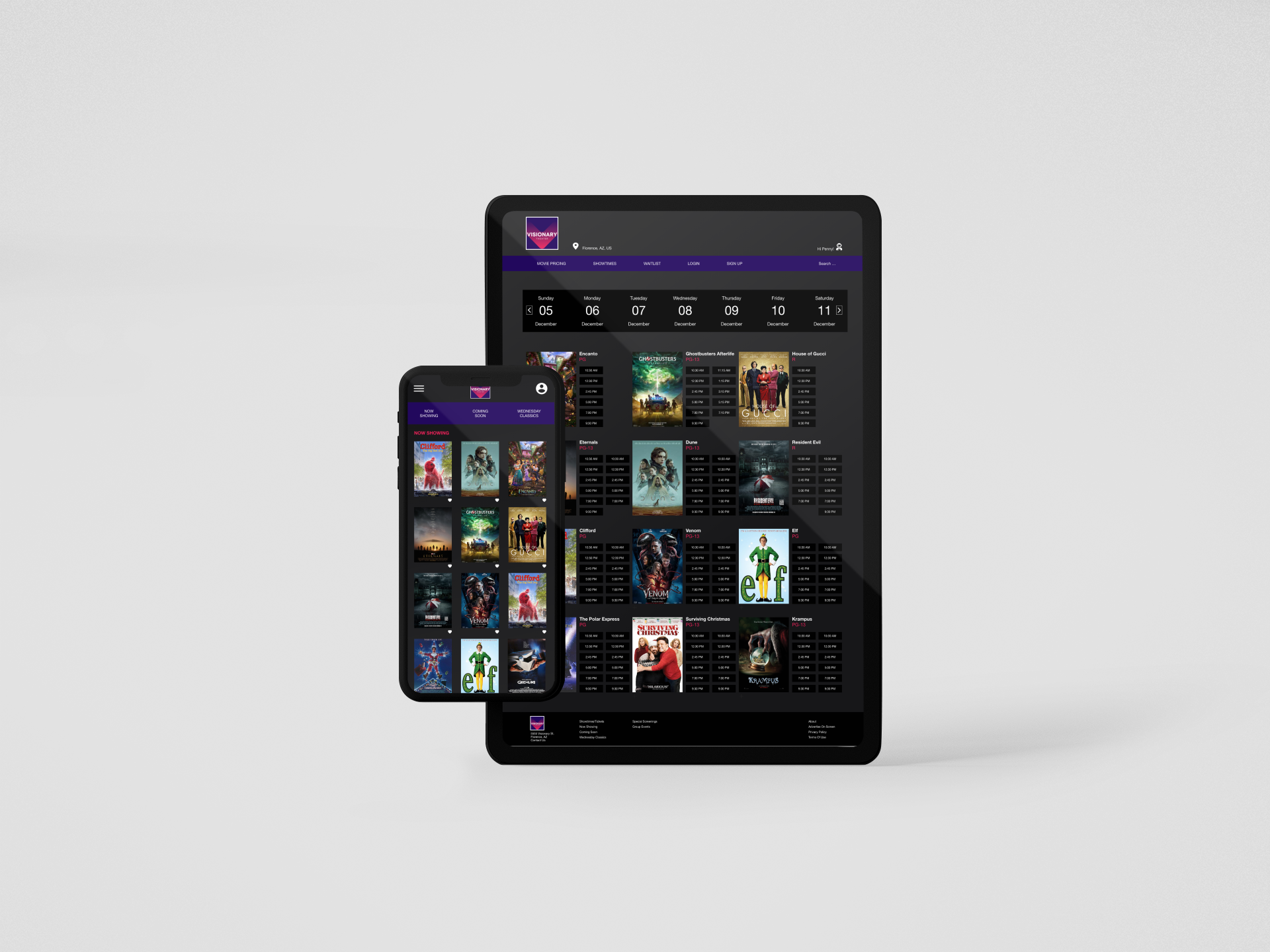
Moving from paper sketches to digital wireframes provided a clearer understanding of how design decisions could address user pain points and enhance the overall experience. Prioritizing the placement of key buttons and visual elements on each page was central to my approach. Given that Visionary Theater’s customers access the website from multiple device types, I also began designing for various screen sizes to ensure a fully responsive site.
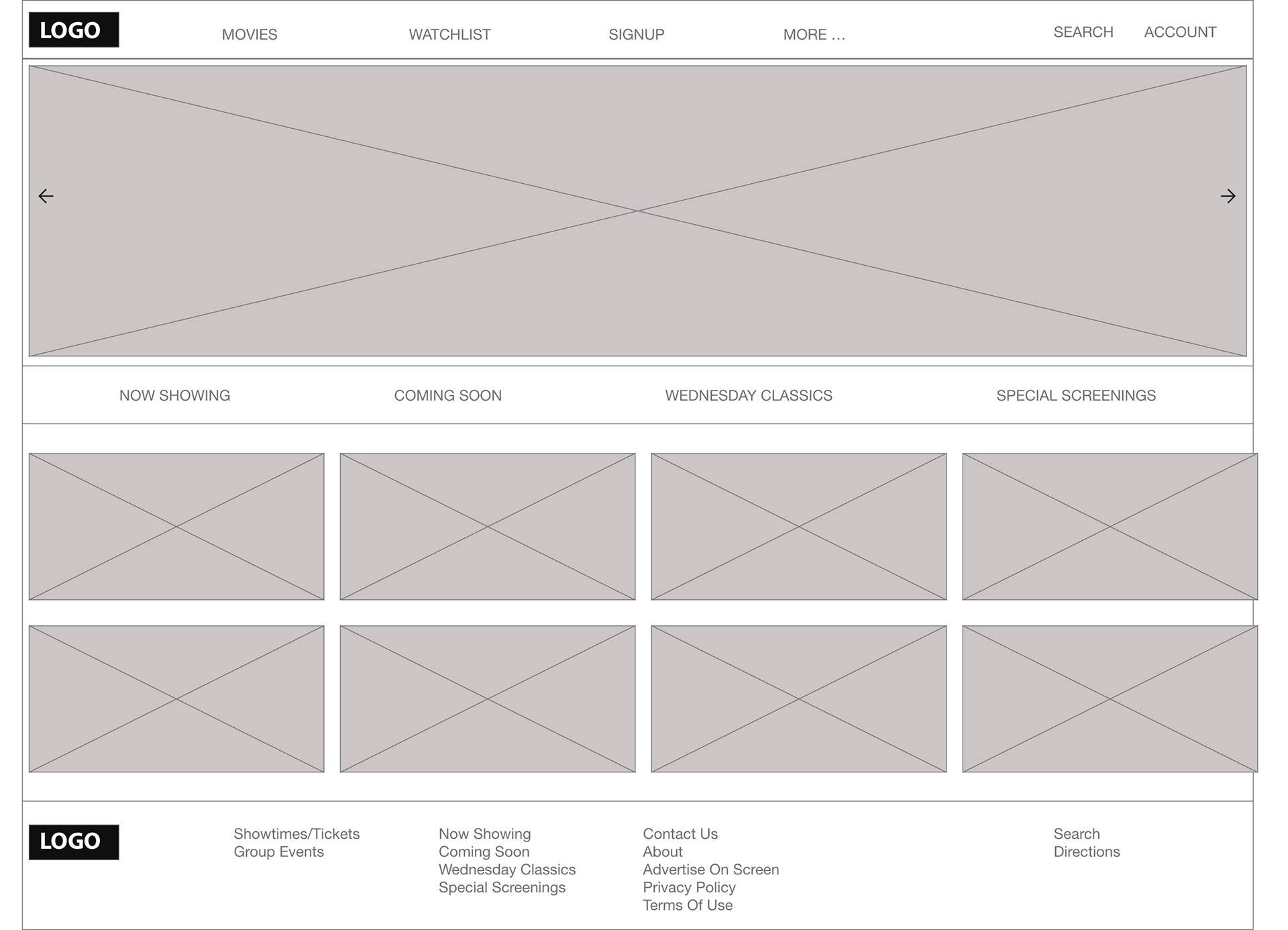
Website home page
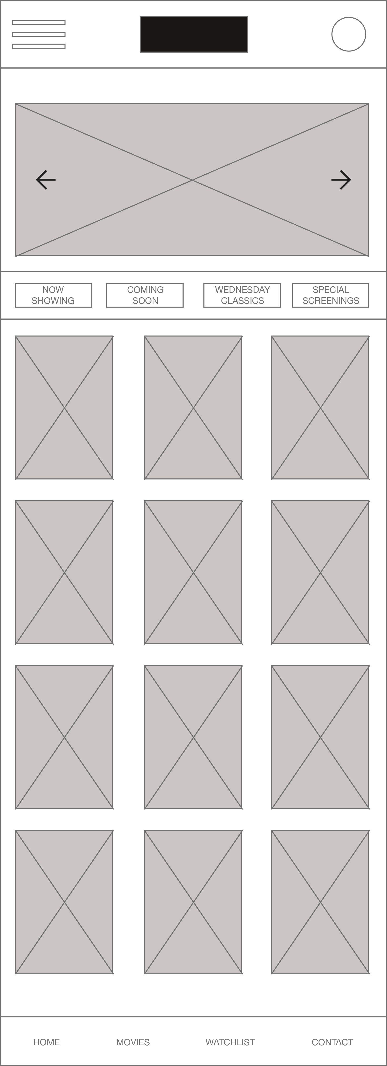
Mobile home page
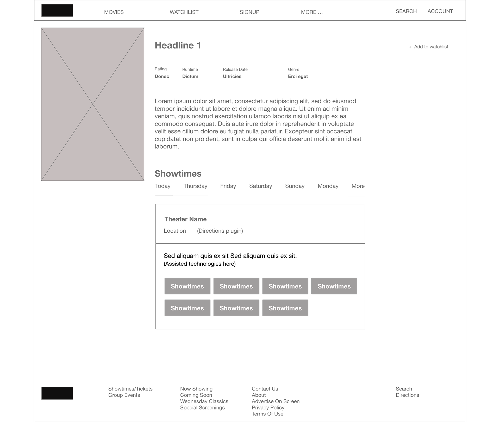
Website movie page
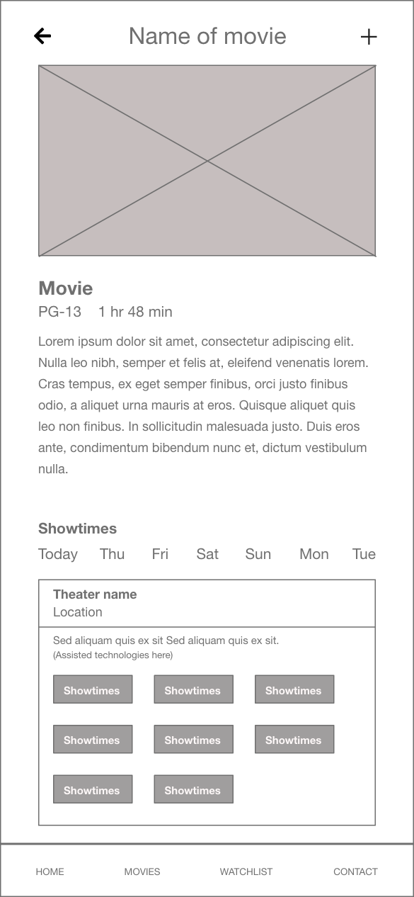
Mobile movie page
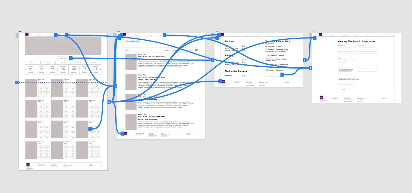
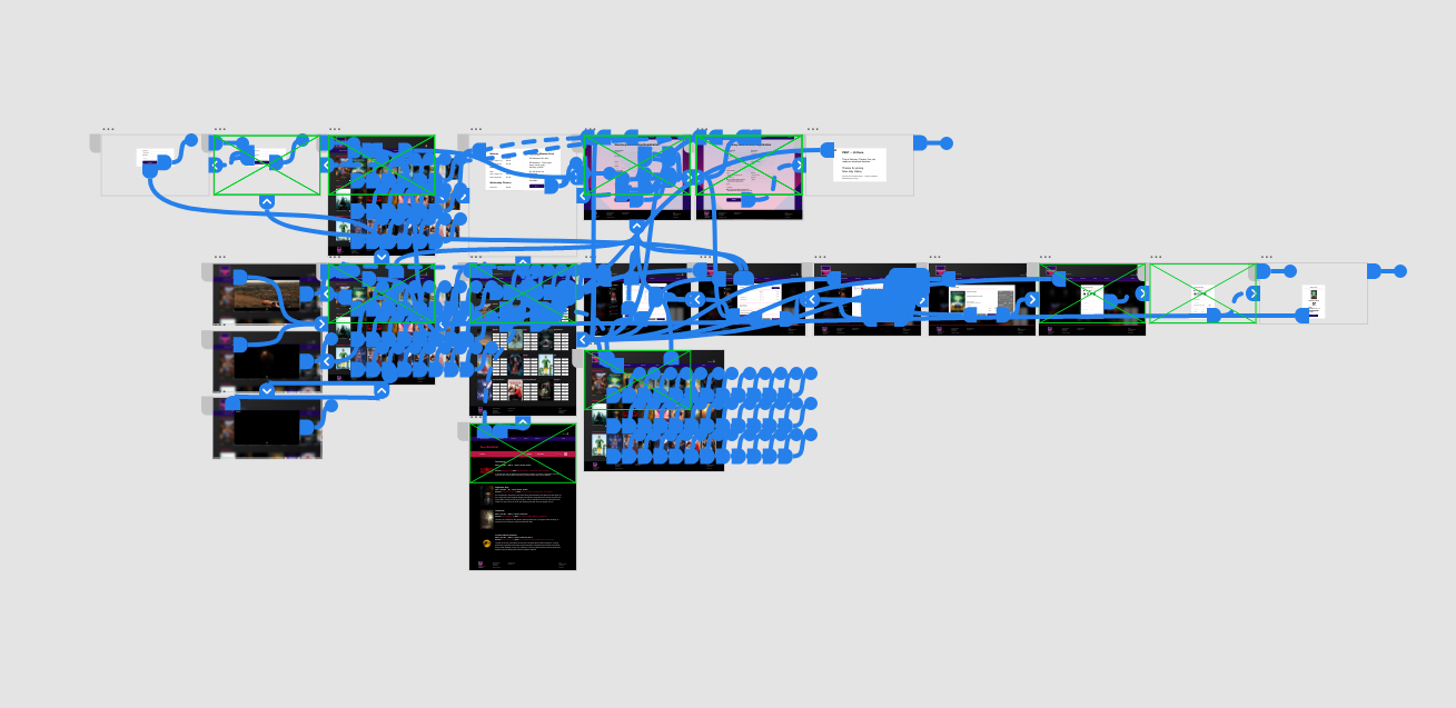
Low fidelity prototype
To create a low-fidelity prototype, I linked all screens involved in the main user flow of adding a ticket to the cart and registering as a member. At this stage, I had already received user feedback on elements like page organization and content simplification. I carefully incorporated several suggestions to address user pain points, improving the overall design.
Usability Study Findings:
I expanded my low-fidelity prototype by adding more screens to enable thorough user testing. For the study, I recruited five participants to test the app during moderated Zoom calls. Users completed the main tasks of choosing a showtime, selecting seats, and purchasing tickets. Testing was conducted both before and after adding visual assets and completing mockups.
The usability study revealed several key findings: users struggled to initiate the ticket-buying process, content organization caused confusion, making it hard for users to find what they needed, and during checkout, users wanted a faster method to enter their card information instead of manually typing all the numbers.
Mockups
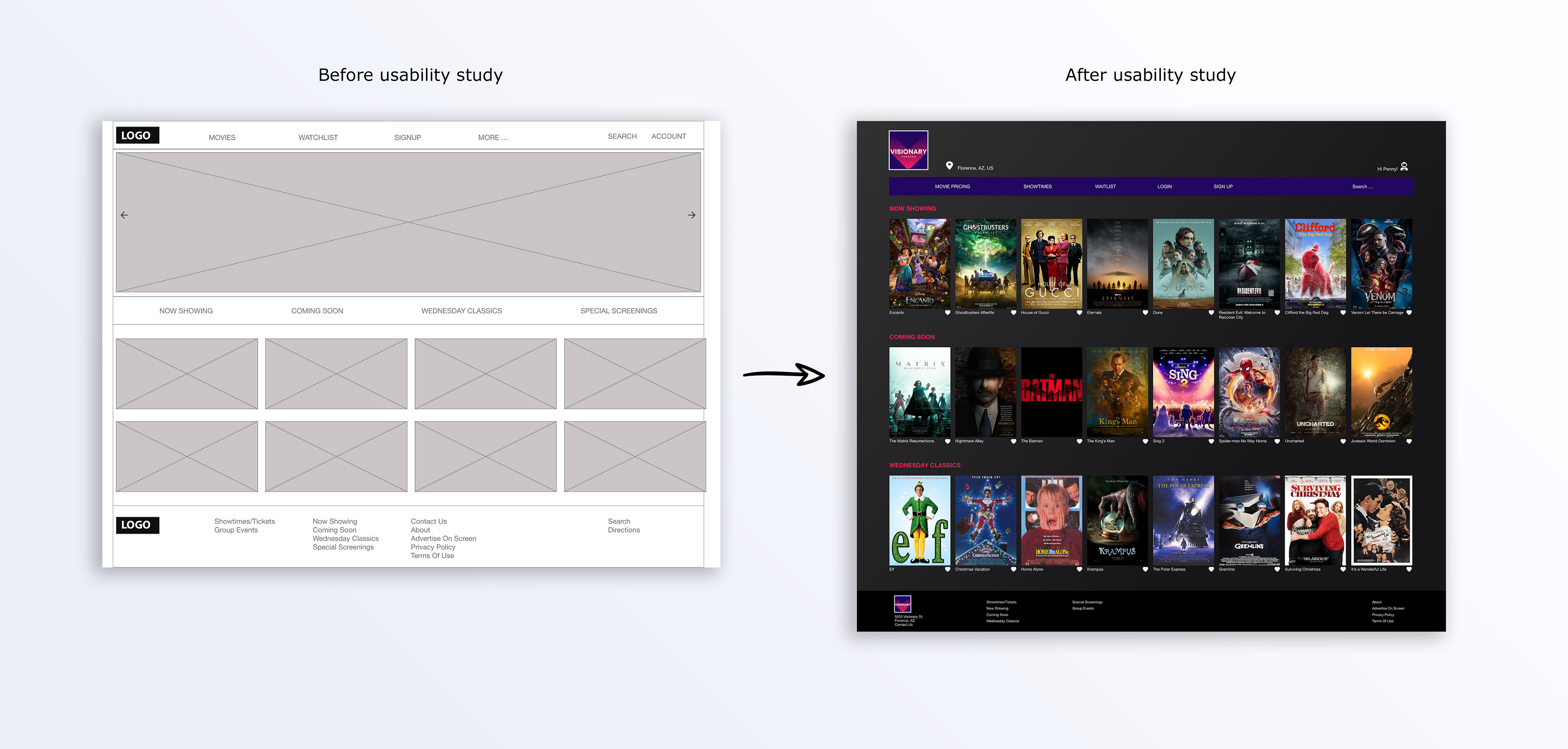
Based on the insights from the usability study, I made changes to improve the site’s organization. One of the changes I made was adding Now Showing, Coming Soon, and Wednesday Classics all on their own separate carousels. This allowed users more freedom to quickly navigate to the movie of their choice. I also removed the hero image because it did not provide any new features or benefits to the user.
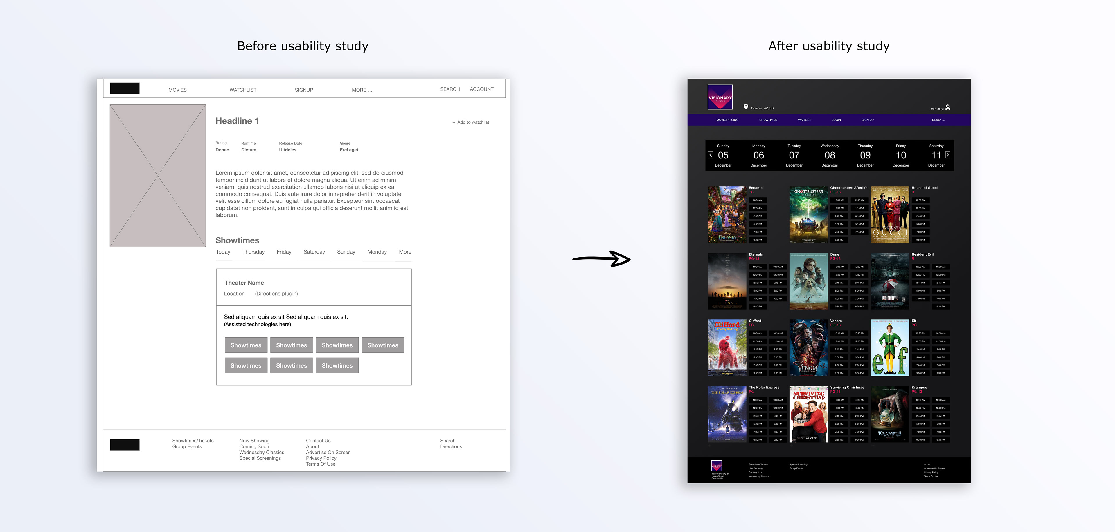
To make choosing a showtime easier I removed the movie synopsis content and focused on redesigning the dates and showtime.
Screen size variations:
I included considerations for additional screen sizes in my mockups. Since users watch movie previews from a variety of devices, I felt it was important to optimize the experience for a range of device sizes, such as mobile and tablet so users have the best experience possible.
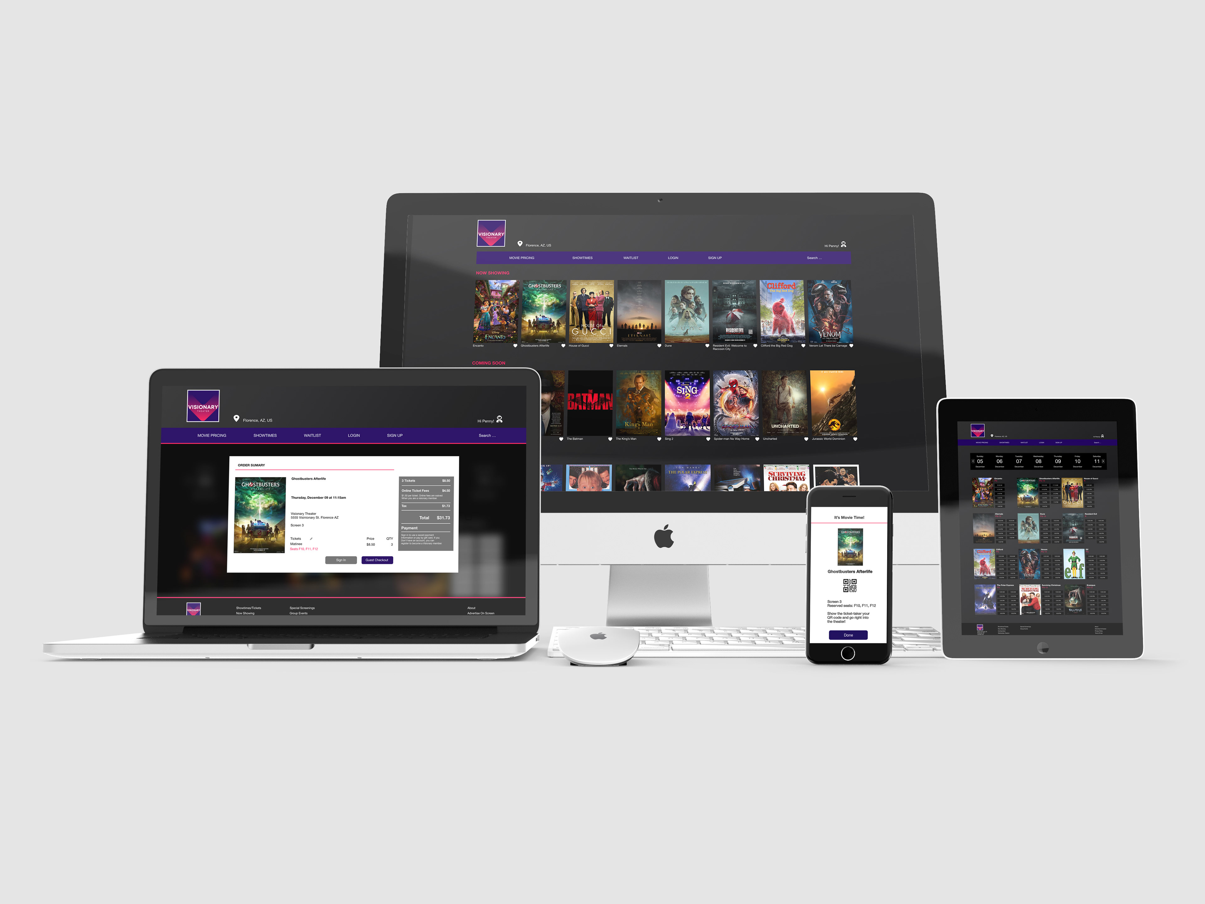
High fidelity prototype:
My hi-fi prototype followed the same user flow as the lo-fi prototype and included design changes, as well as several other changes made after the usability study; all geared toward a simple and easy way to preview a movie, select showtime, choose seats, and purchase tickets.
Design phase:
The creation of the logo played a key role in determining the color palette and font choices for the entire website. I experimented with different color iterations to find a combination that would stand out from competitors and effectively represent the brand.

Final Logo
Impact:
My target users shared that the final design was easy to navigate and very intuitive. “It’s a nice change of pace to actually navigate a movie site successfully to purchase tickets to a show without much hassle.”
What I learned:
Do not overcomplicate the process with so much information. Keeping the content simple and easy to navigate is the key to a happy user.
© 2025 Tyler Goodwin. All rights reserved.