Dizzle's Food Truck App Case Study
UX Researcher // UX Designer
The Challenge:
Many people find it difficult to get meals quickly during long workdays, especially when good food options nearby are limited. Often, they either need to bring their own food or rely on vending machines with limited choices.
The Goal:
Dizzle’s Food Truck offers an experience with classic burgers featuring unique twists and mouth-watering tacos—comfort food that pushes culinary boundaries. They are committed to creative gourmet options, excellent customer service, and top-quality ingredients. The goal is to capture the essence of Dizzle’s by creating a mobile ordering app that enables users to geo-locate the food truck, browse the menu, and pre-order meals, allowing them to pick up food quickly and make the most of their meal breaks without waiting.
How did I go about the process?
First I had to understand the user. I did this by conducting user research, coming up with personas, creating problem statements, and user journey mapping.
User research summary:
To develop an effective design solution, I conducted targeted online user interviews with open-ended questions to understand the challenges people face when planning meals during a typical workweek. The research confirmed my assumptions about time constraints around acquiring food but also revealed additional issues: many users don’t have time or don’t want to prepare food at home. Other pain points included a lack of nearby food options, the need for affordable meals, the ability to place group orders, and the desire to customize ingredients.
Target Audience:
Ages 18 - 65 yrs old who frequent fast food, restaurants, and convenience stores for their daily lunch. They include full and part-time workers, students, and parents.
Pain points:
Four points emerged after collecting the surveys
1. Time: They do not have time to wait in line. The checkout process to acquire a meal is time-consuming and they have busy schedules.
2. Location: It's difficult to find food when there are no restaurants, fast food, or convenience stores nearby.
3. Money: They do not want to spend lots of money on a meal, especially if they are eating out almost every day.
4. Choice: They want the ability to alter ingredients based on their allergies.
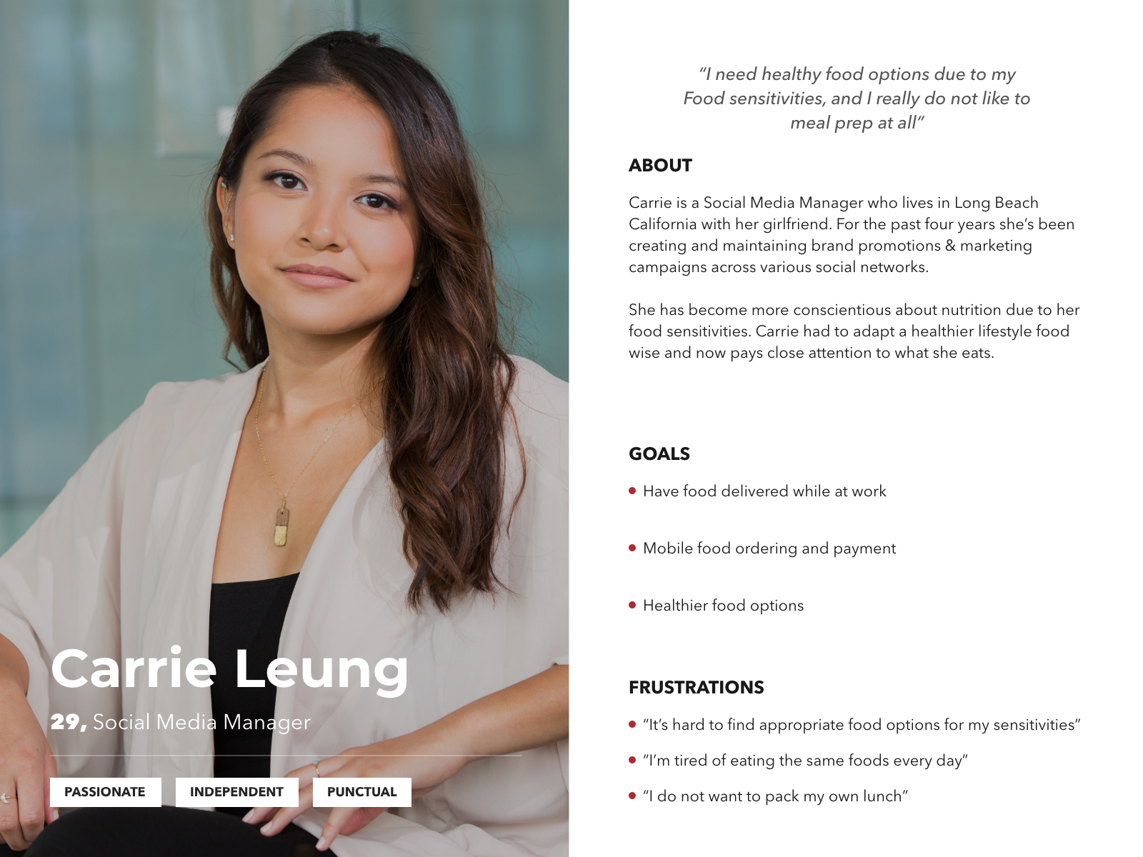
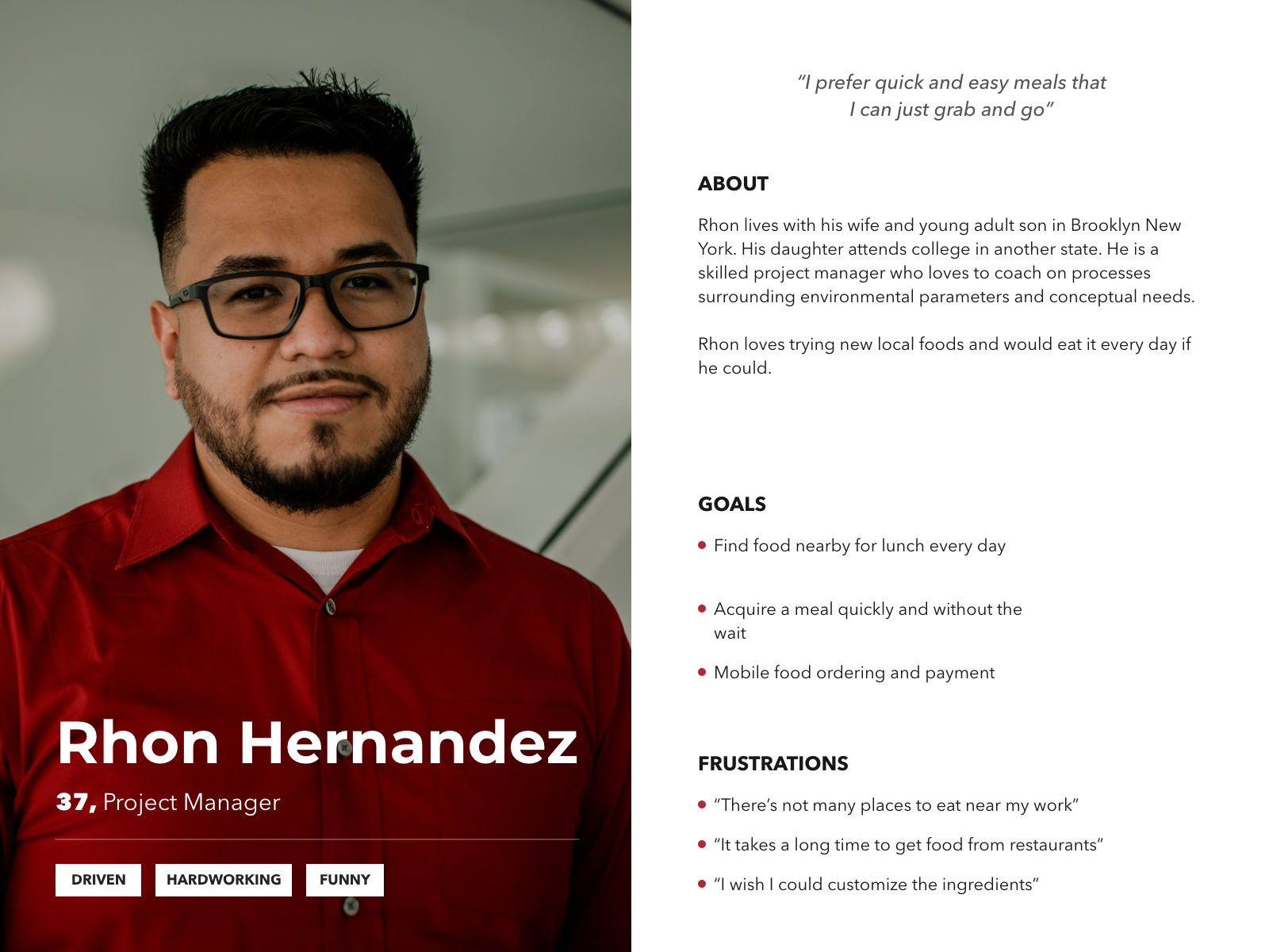
Personas:
Based on the survey responses two personas were created for this project. The ingredient customizer and the grab-and-go foodie.
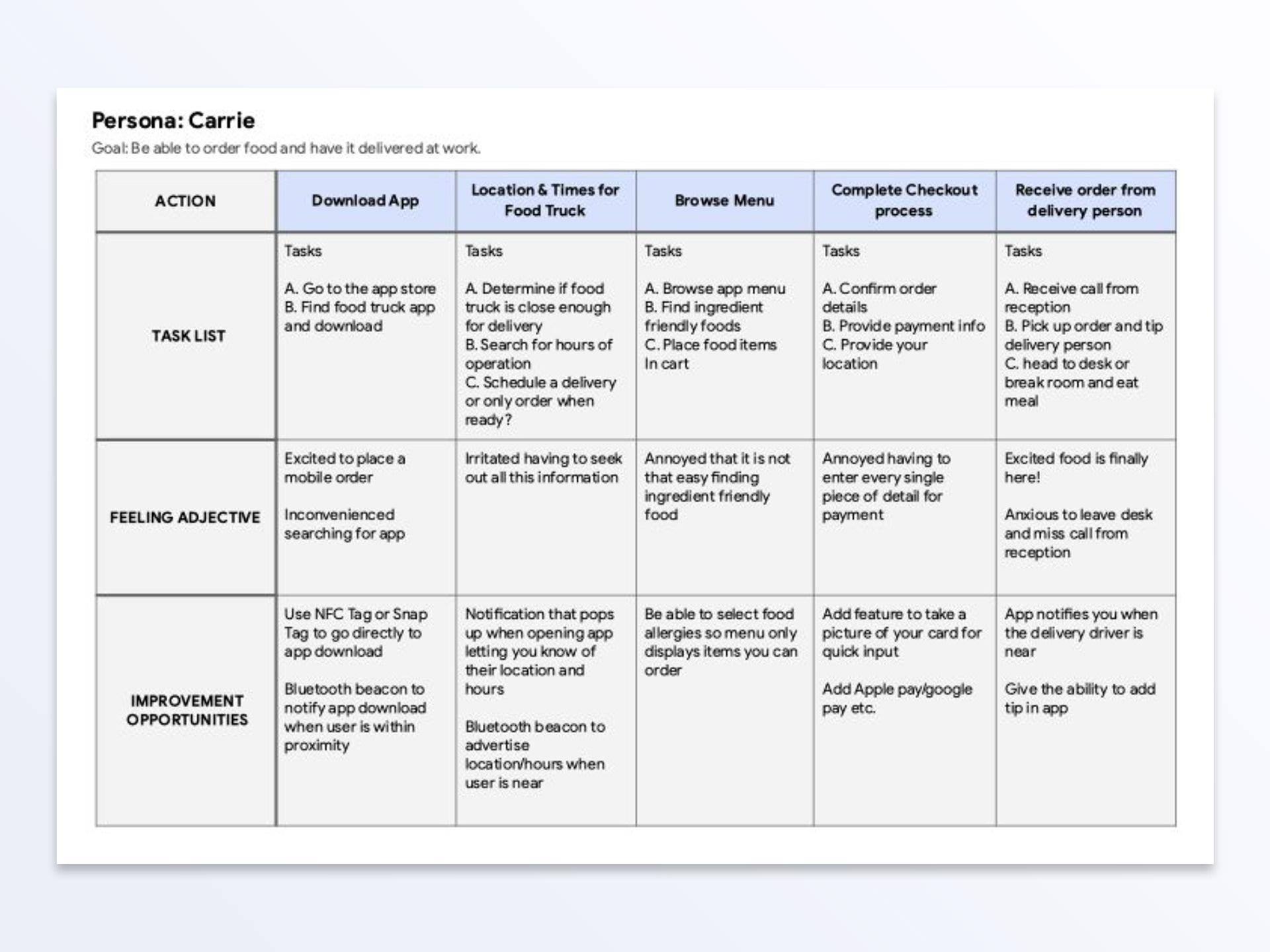
User Journey mapping:
After mapping out a few personas and learning from the user surveys I gained a solid understanding of what to include during the initial launch.
Jumping into the design phase
I started by sketching ideas on paper, which I then transformed into digital wireframes. Using these, I created a low-fidelity prototype that I employed for usability testing.
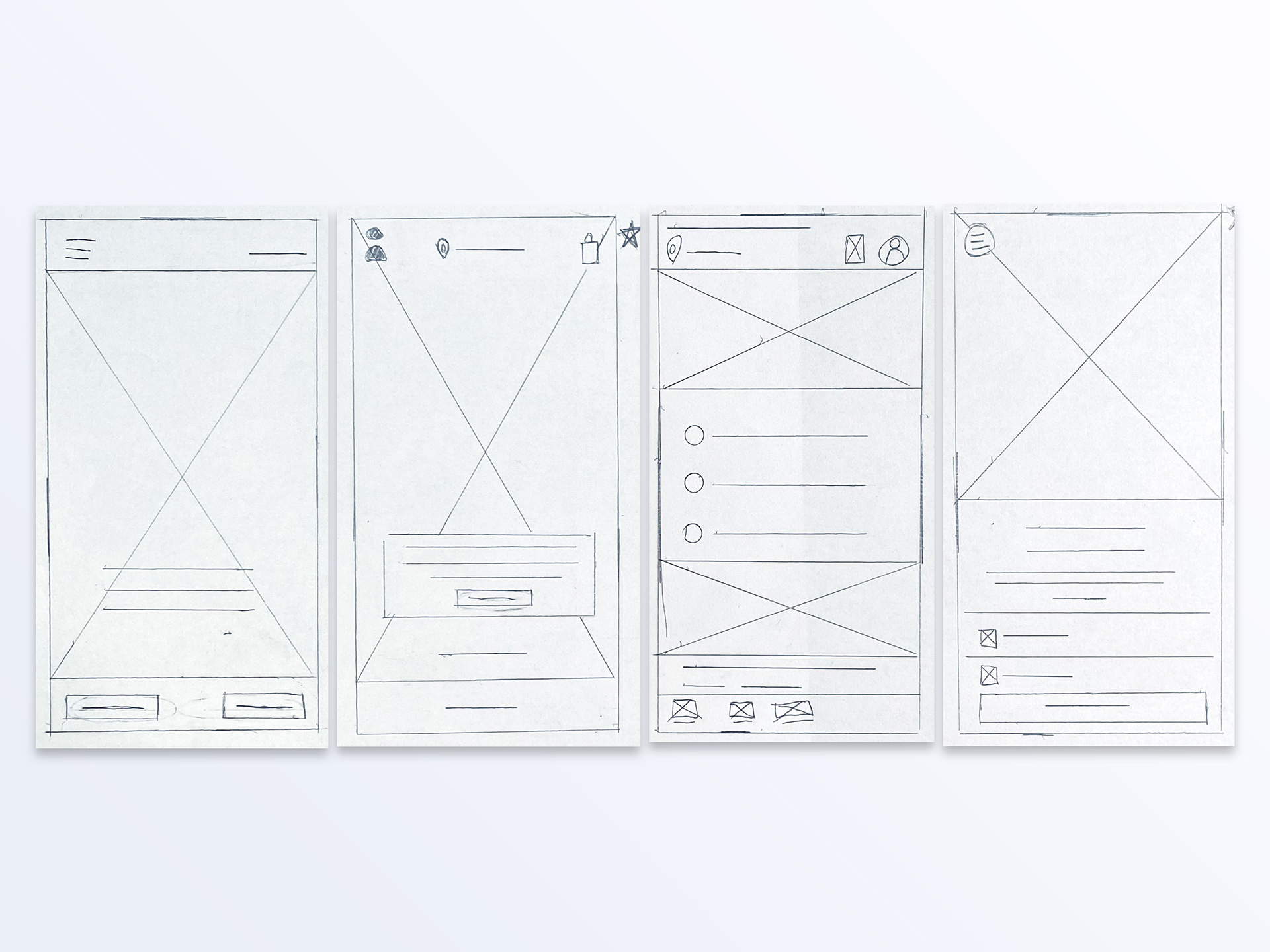
Paper wireframes
To start off, I drafted iterations of each screen of the app on paper to focus on user pain points.
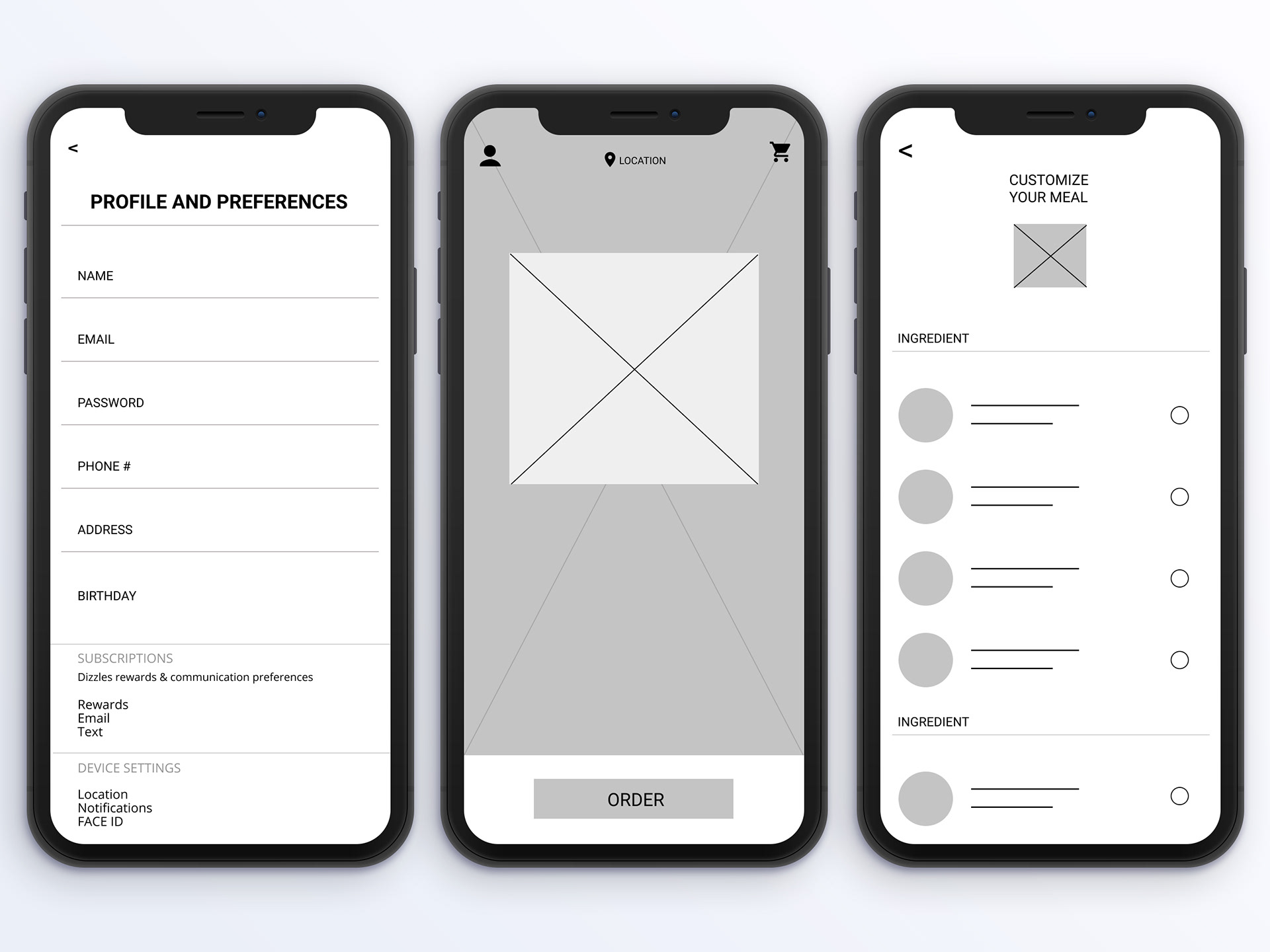
Digital wireframes
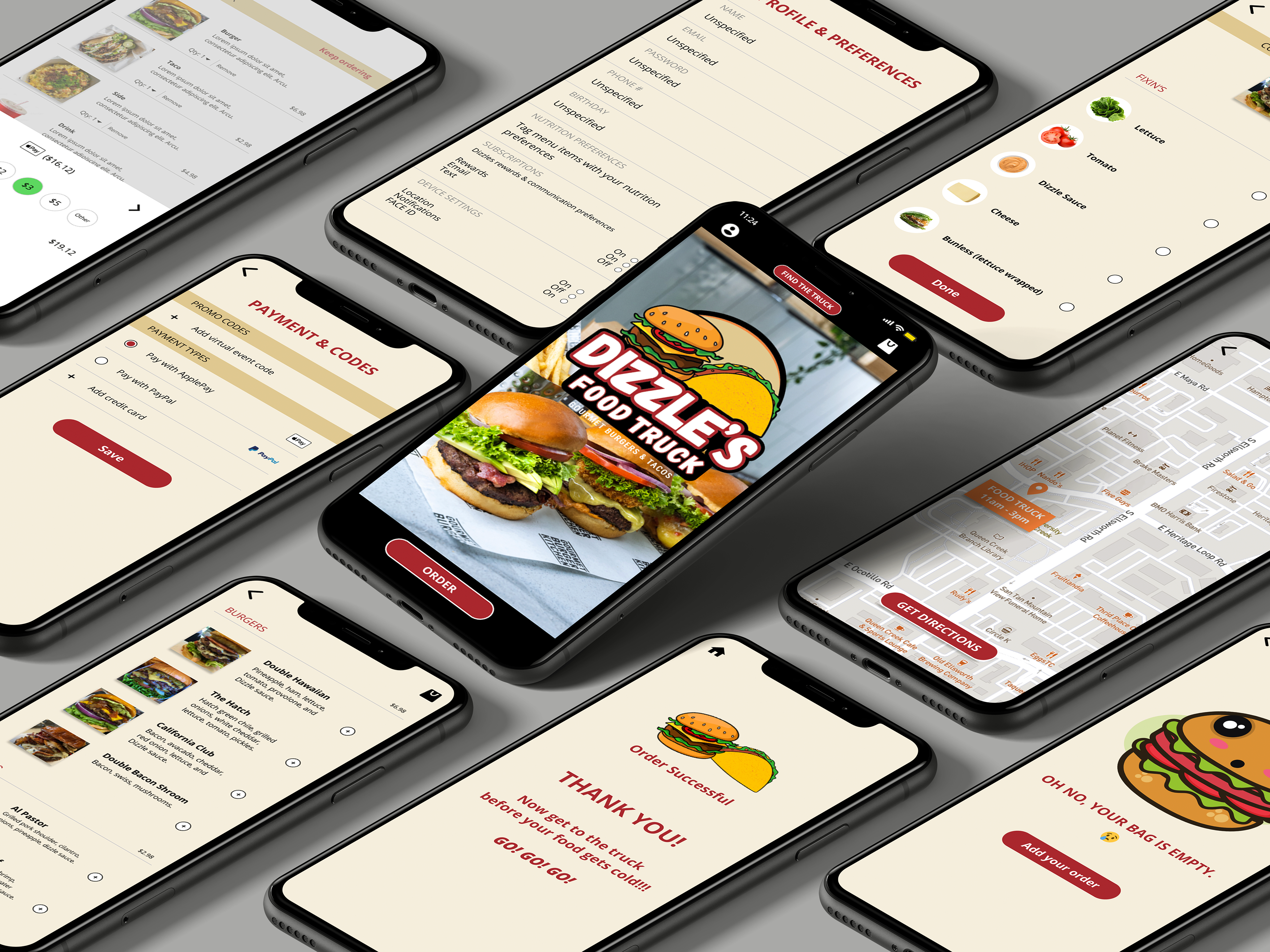
During the initial design phase, I based screen layouts on user research and feedback. For the home screen, I prioritized a quick and easy ordering button to help users save time. I also placed a location button at the top of the screen for users to easily find the food truck.
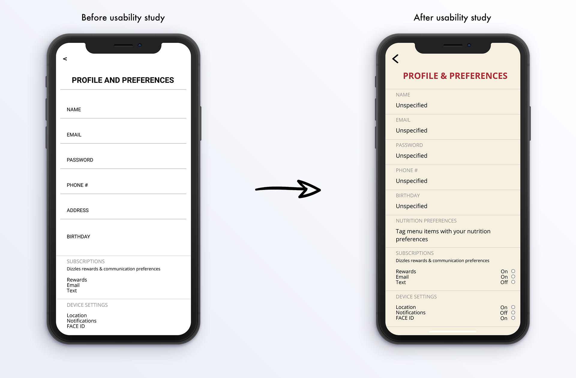
Additionally, users requested control over the app’s interactions when not in use, so I added a subscriptions and device settings section under profile and preferences.
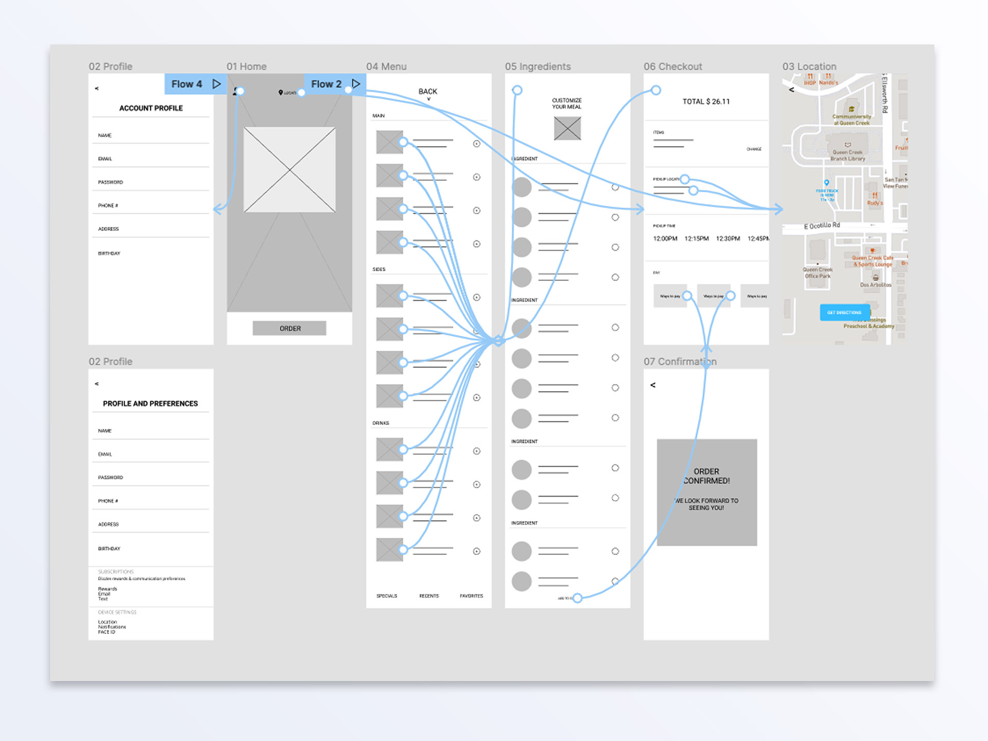
Low-fidelity prototype
Using the finalized digital wireframes, I developed a low-fidelity prototype. The main user flow focused on building and ordering a meal from the Food Truck, allowing the prototype to be effectively used in a usability study.
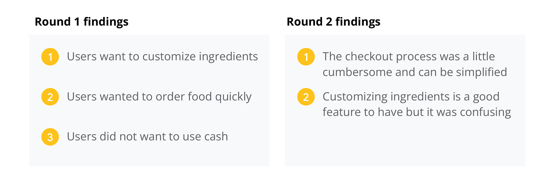
Usability study: findings
I conducted two rounds of usability studies. Insights from the first round guided the transition from wireframes to mockups. The second round utilized a high-fidelity prototype and identified which aspects of the mockups required further refinement.
At this stage of the project, I started to refine the design through mock-ups, a high fidelity prototype, and accessibility.
Mockups
Early designs were geared toward the basic user profile. After the usability studies, I added additional options to the profile page to give users more control over app preferences.
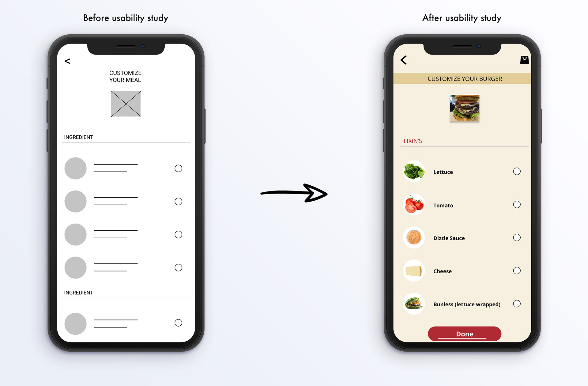
The second usability study revealed frustrations with customizing the meal. I broke down the ingredients by item, and the ability to select ingredients. I also added a “done” option to this screen.
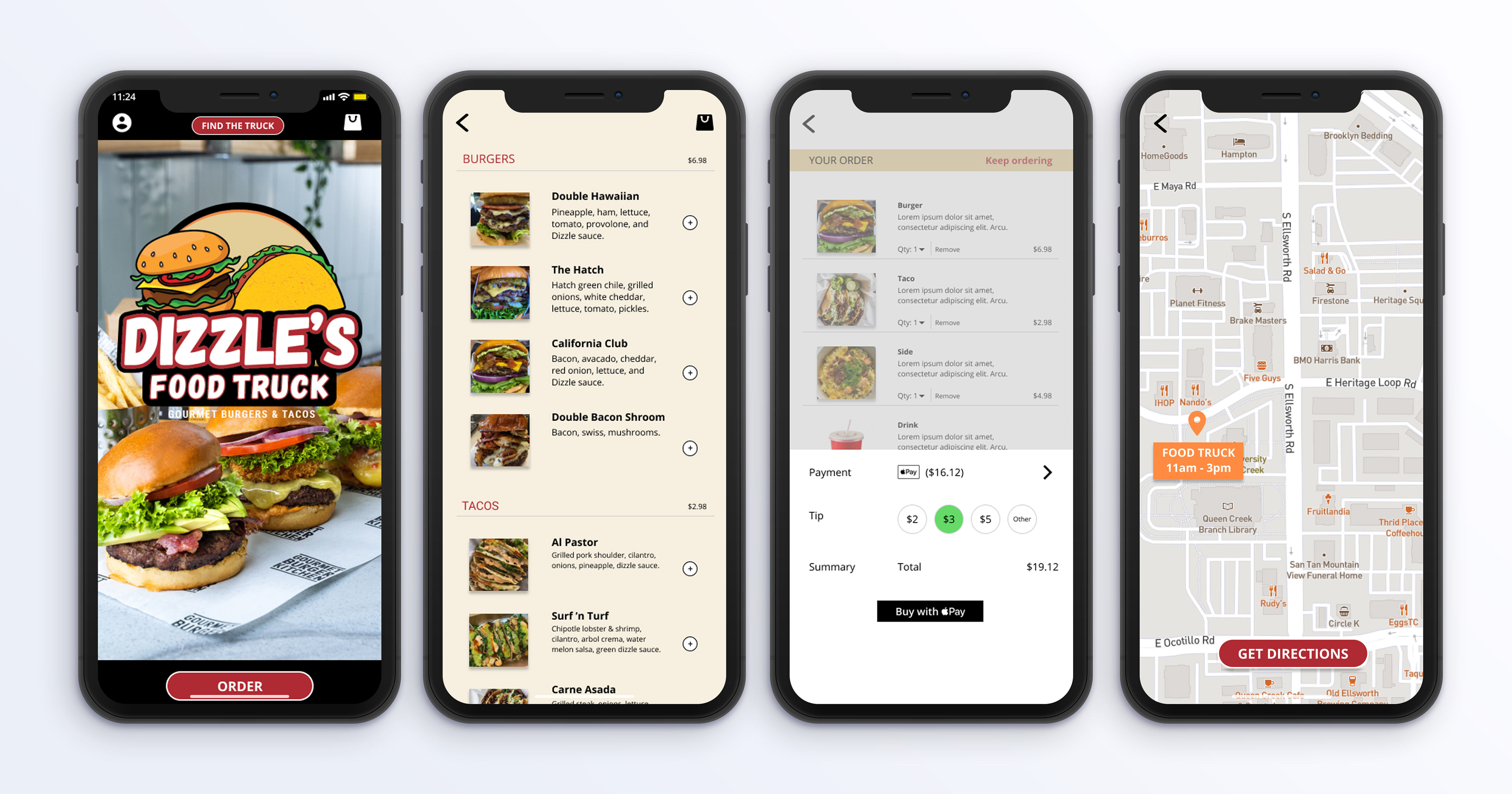
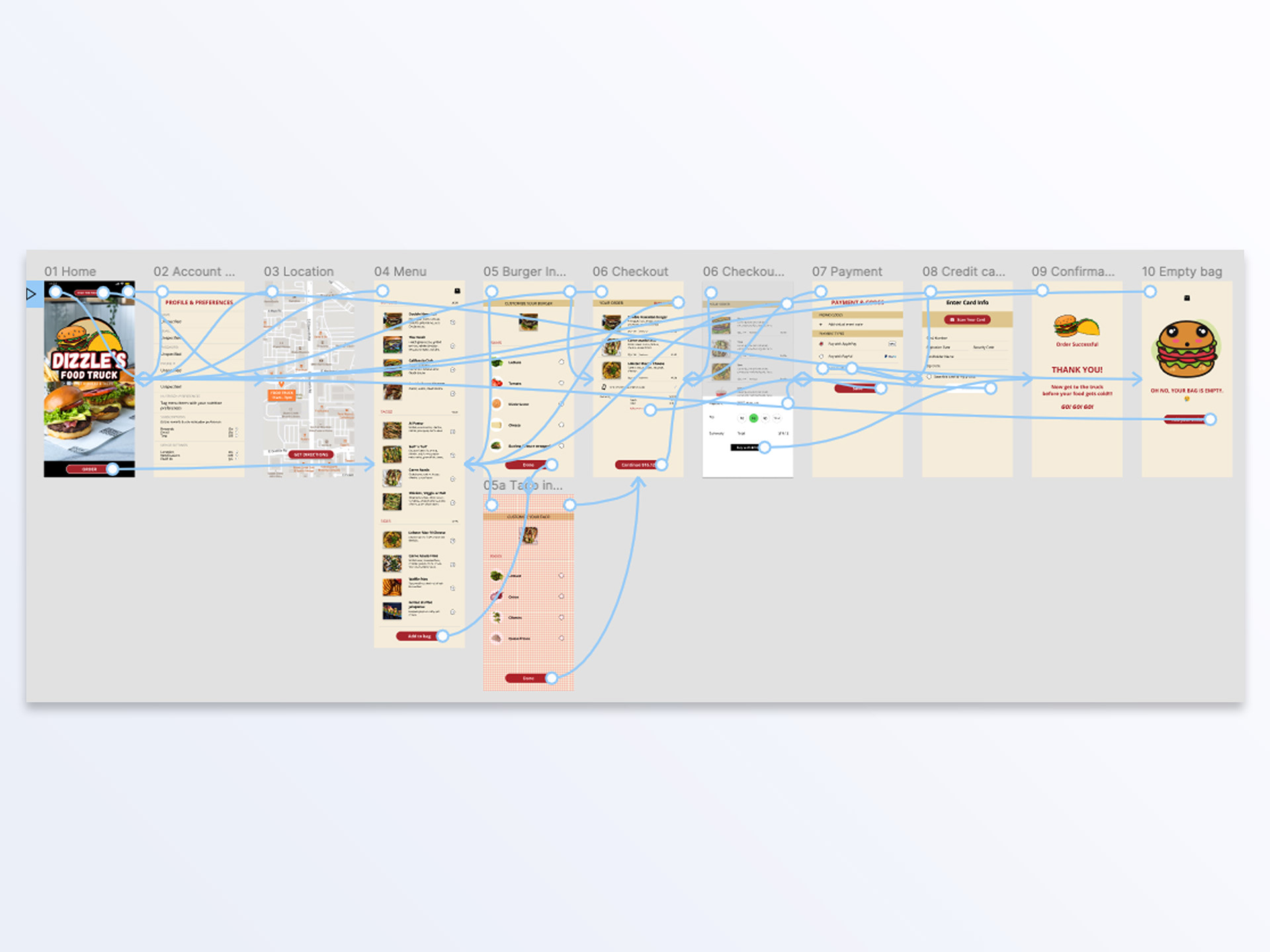
High-fidelity prototype
The final high-fidelity prototype presented cleaner user flows for ordering a meal and checking out. It also satisfied user needs for more customization with ingredients and the option for more features.
Impact:
Dizzle’s Food Truck app addresses the need for convenient food access near workplaces.
One user shared, “I like that I can customize my food choices and order without waiting—I’d definitely use the app instead of bringing my lunch to work.”
What I learned:
My initial assumptions about what users wanted in a food truck ordering app evolved quickly. The design process uncovered many perspectives I hadn’t previously considered. Usability studies shaped each iteration, helping to streamline and improve the overall user experience.
© 2025 Tyler Goodwin. All rights reserved.