Client
Non-Profit: Nashville Peacemakers
What we delivered
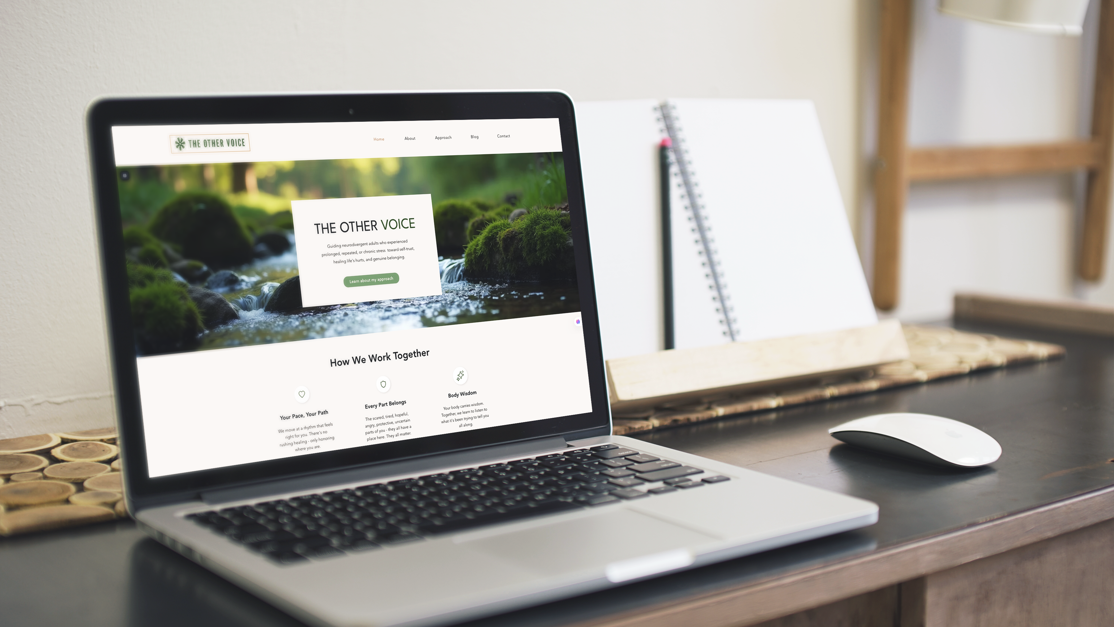
Web re-design
App design
The Nashville Peacemakers is a nonprofit organization dedicated to reducing violence and fostering community peace in Nashville through outreach, education, and conflict resolution initiatives.
Current Experience:
The website serves as a key channel for donations, volunteer sign-ups, and event information. However, several issues hinder its effectiveness in clearly communicating the organization’s mission:
• Outdated Design: The site’s look and feel are dated, with a color scheme, typography, and layout that could benefit from modernization to create a fresher, more engaging experience.
• Outdated Design: The site’s look and feel are dated, with a color scheme, typography, and layout that could benefit from modernization to create a fresher, more engaging experience.
• Poor Mobile Responsiveness: The website is not fully optimized for mobile devices, leading to a subpar experience for many users, given the growing use of smartphones and tablets.
• Cluttered Navigation: The navigation menu is overly complex and can confuse users. Streamlining and organizing menu options would help visitors find what they need with ease.

Behind the scenes
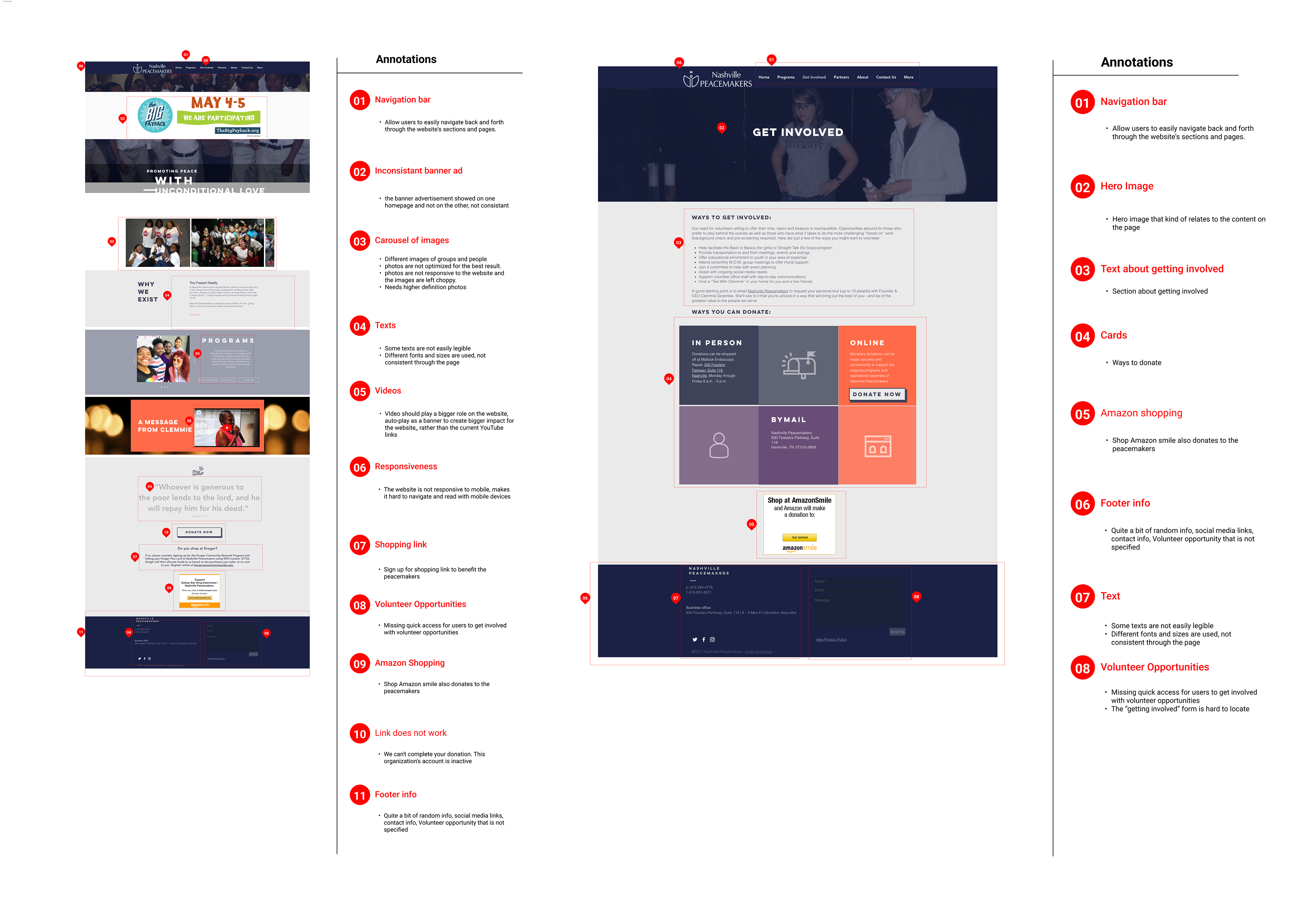
In the initial phase of the website redesign, we captured full-page screenshots of key layouts and conducted a thorough heuristic analysis. We then annotated these elements to better understand the current design and brainstormed new ideas to improve usability and overall user experience.
Our Approach
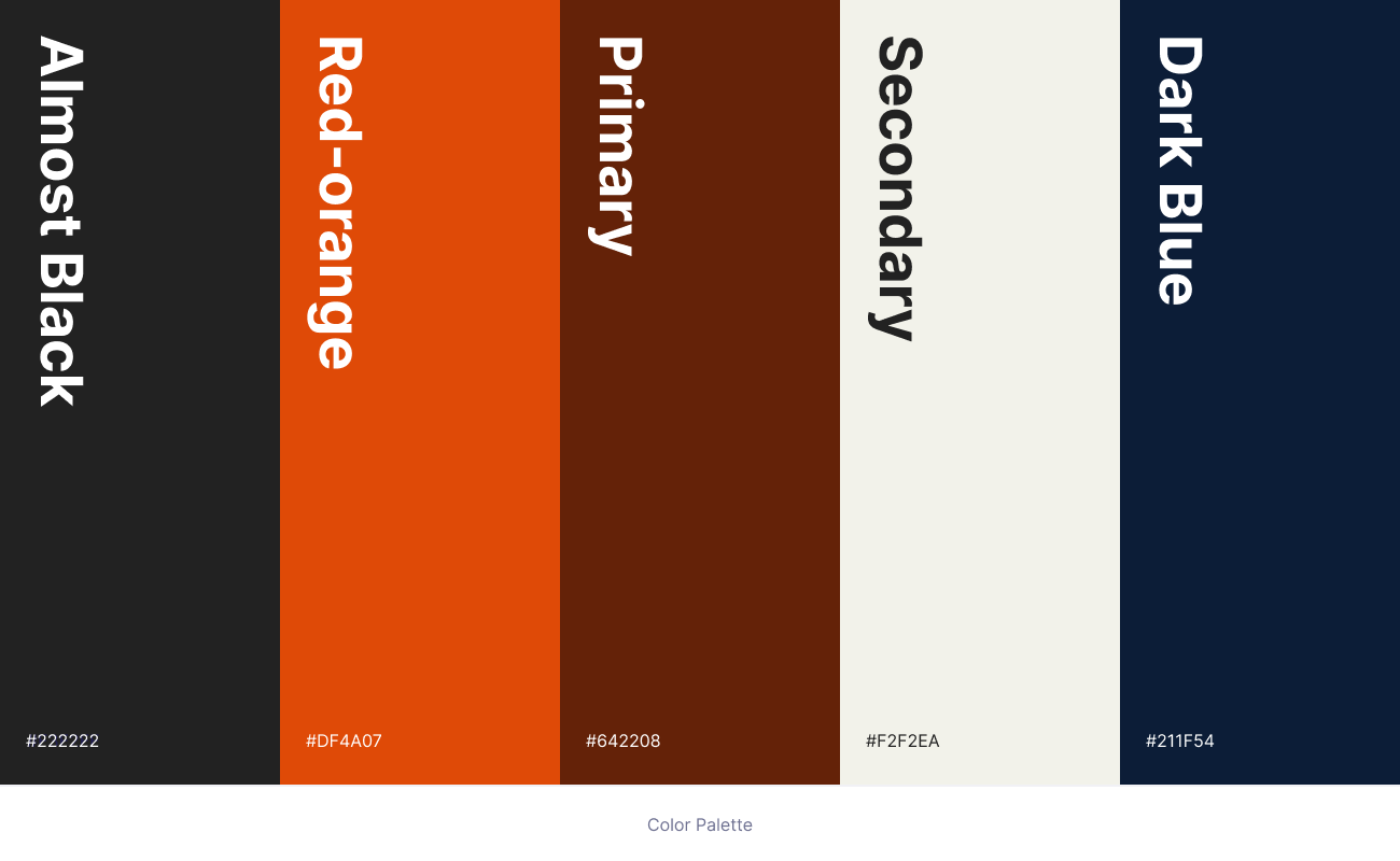
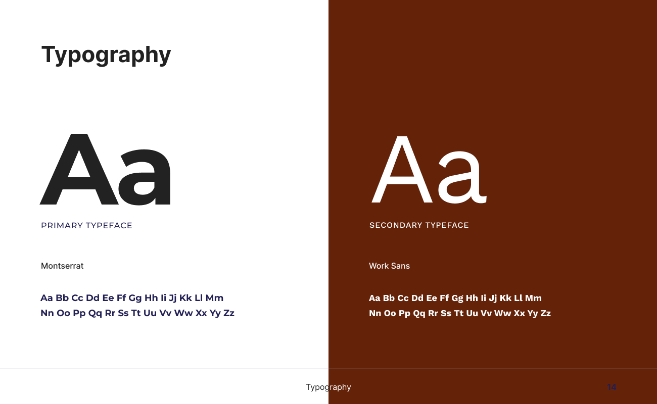
For the Nashville Peacemakers website redesign, we began by identifying key areas for improvement. Through interviews, we defined the organization’s brand identity—its mission, values, and target audience—to guide our design decisions and ensure the new site truly reflects the organization. We developed a cohesive design system, including color palette, typography, and visual elements, to maintain consistency throughout the site. Content was organized logically with a clear navigation structure that highlights the most important information. To develop the color scheme, I created a style tile inspired by the local Nashville scene, drawing from the fonts, colors, and styles of area signage and imagery.
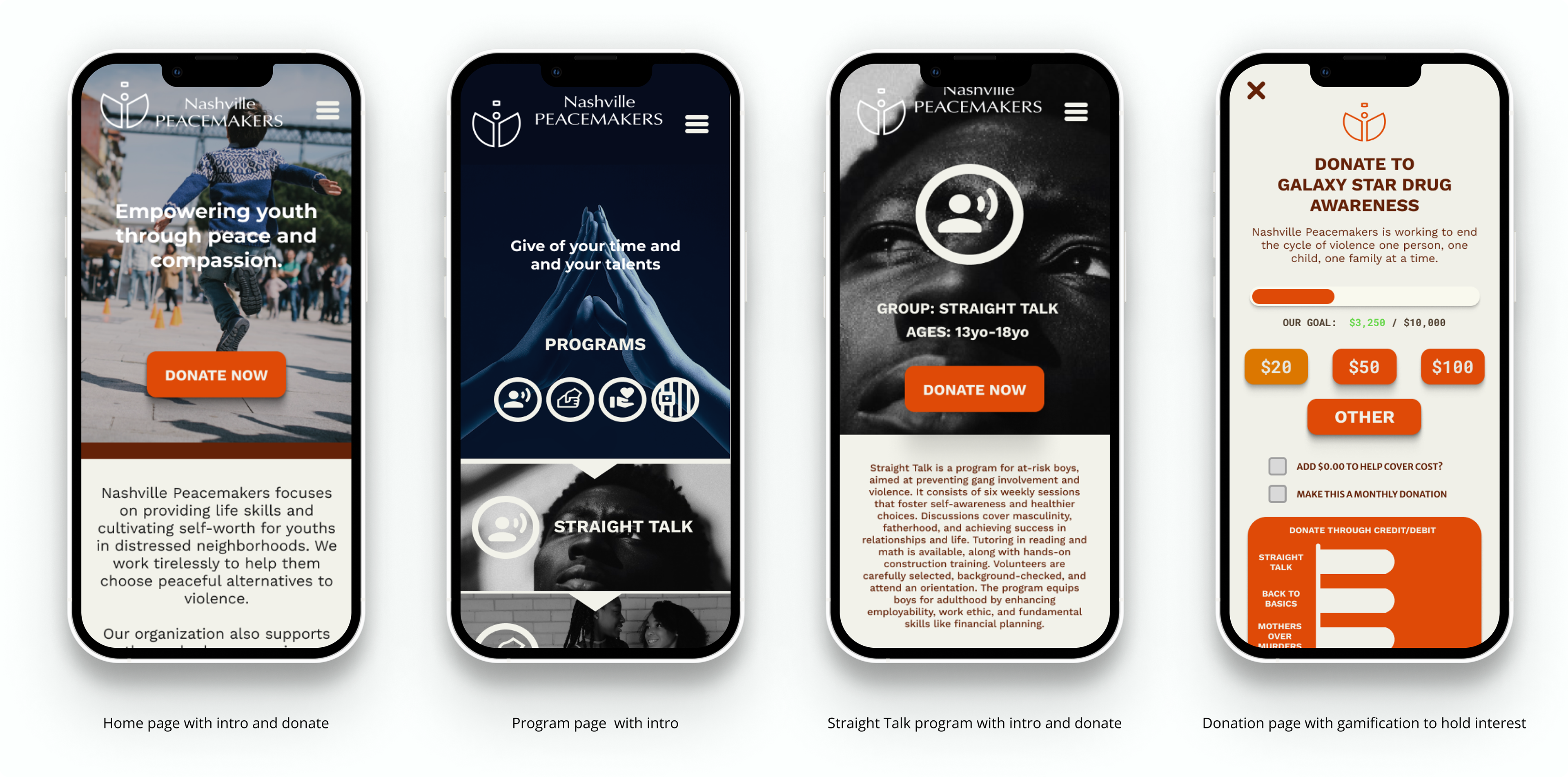
Application of visual system
We prioritized a mobile-first approach to demonstrate our commitment to user-centered design. Since mobile users make up a large portion of online traffic, starting with mobile ensures a seamless, responsive experience across all devices.
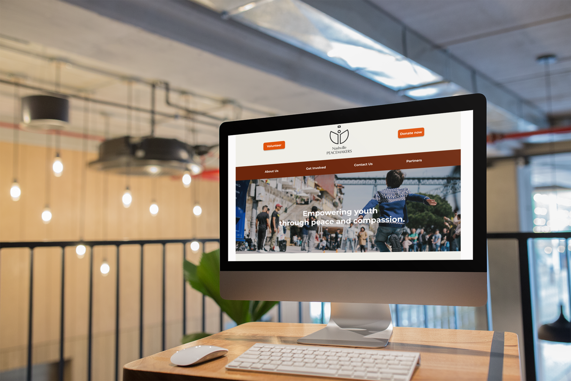
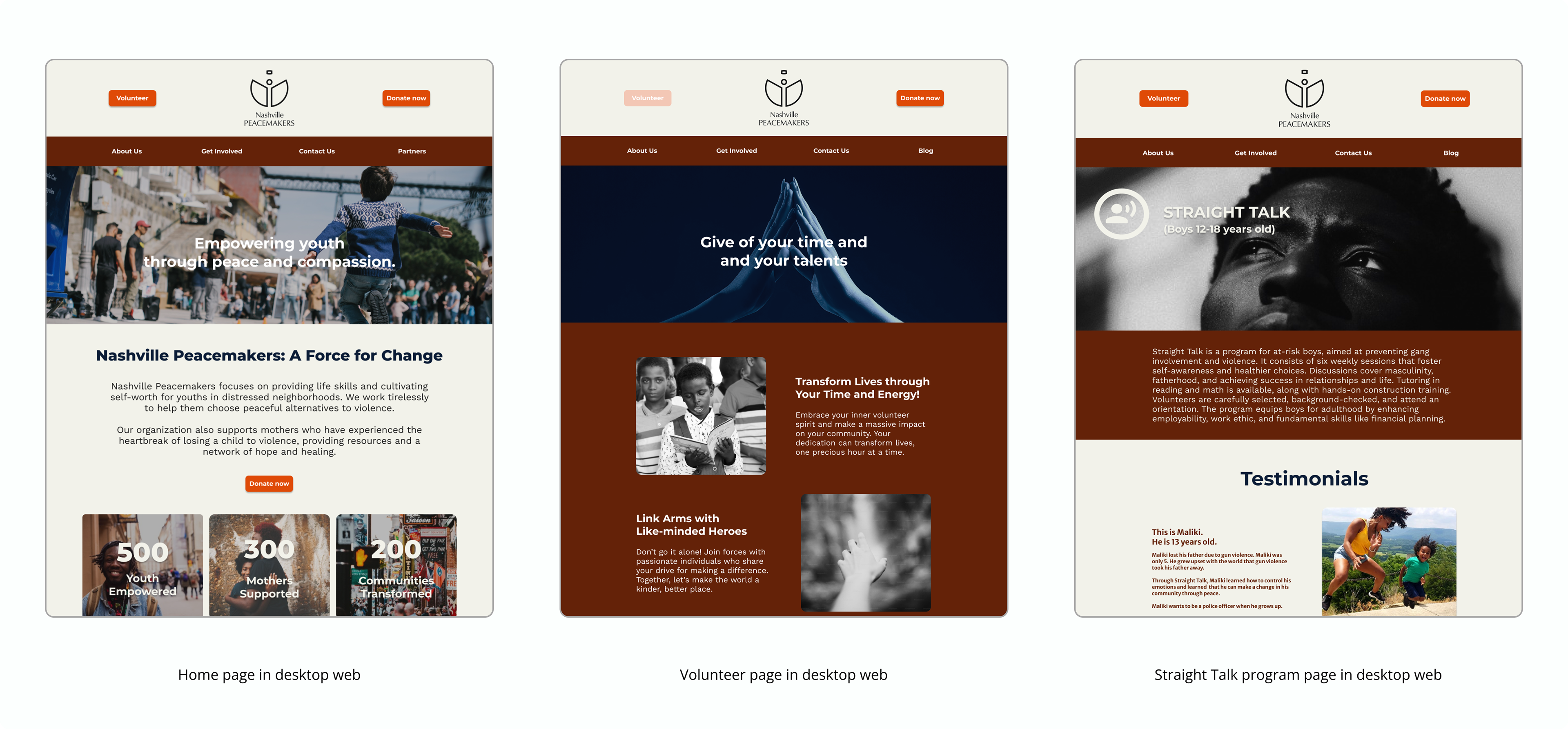
Desktop
I applied responsive web design principles to create a smooth user experience across all devices. Building on the mobile layout, I optimized navigation, interactions, and visuals for larger screens. Through iterative usability testing and feedback, I made ongoing performance improvements to ensure consistent engagement and usability on every platform.
© 2025 Tyler Goodwin. All rights reserved.